Redesigns are tricky business. Brands pour time, money, and PowerPoint presentations into reinventing themselves—but sometimes, what comes out the other side looks like a group project that ran out of time and budget. People grow attached to a brand’s look and feel, so when a redesign hits the internet and misses the vibe completely, reactions are swift… and usually brutal.
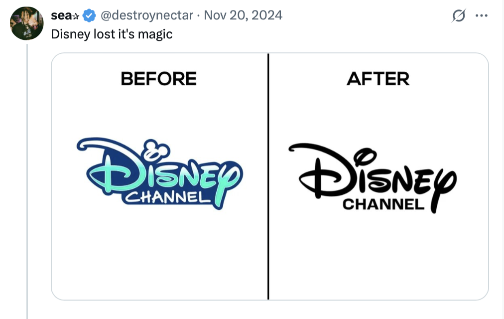
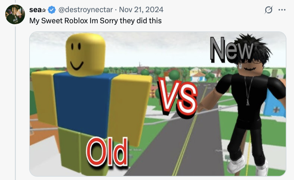
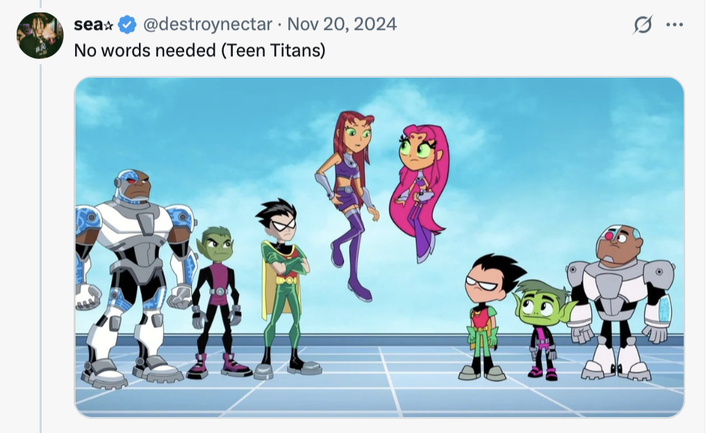
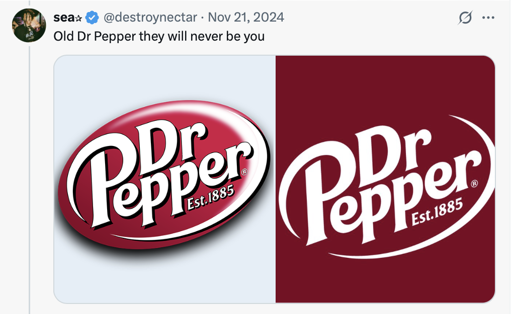
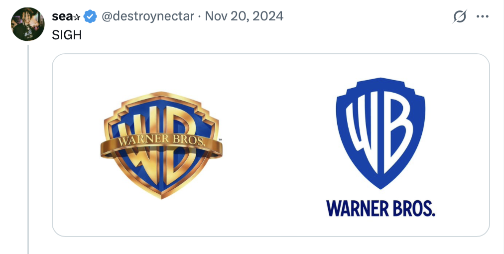
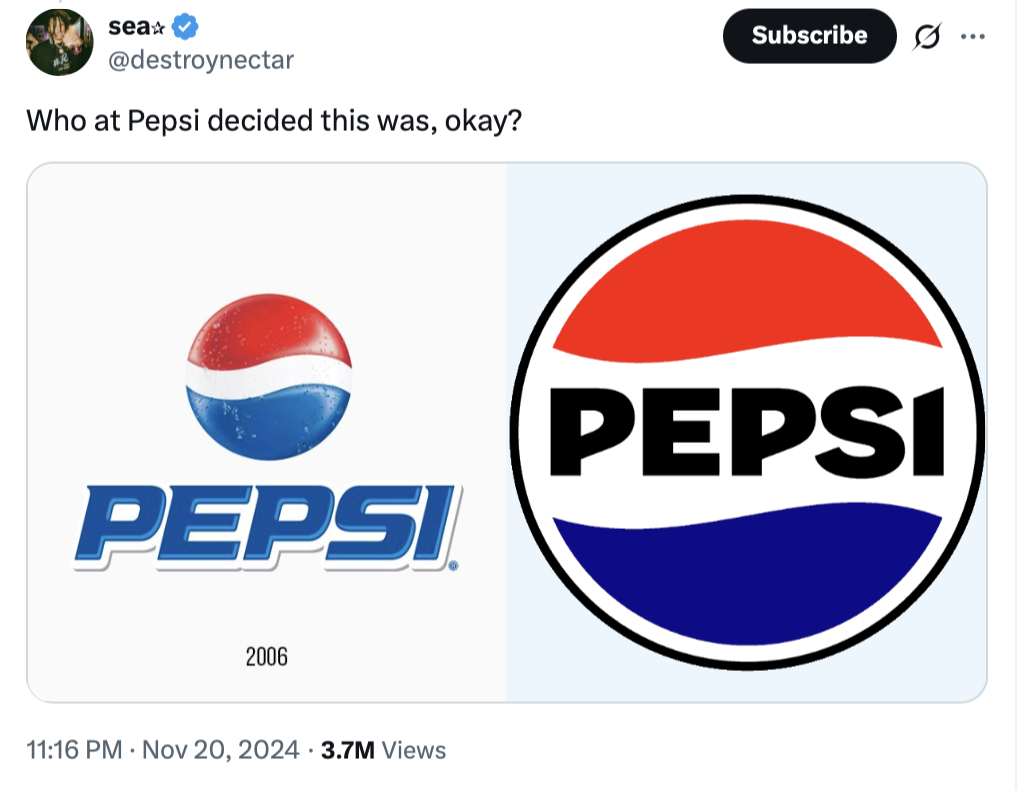
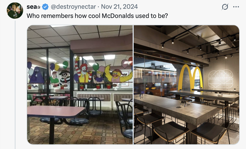
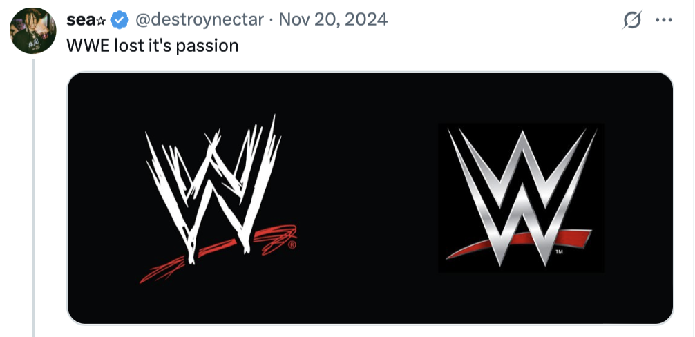
We stumbled across a brilliant Twitter thread by @destroynectar that rounds up some of the most questionable redesigns ever pushed live. From logos to layouts, these “upgrades” should’ve stayed in the drafts folder.
1.
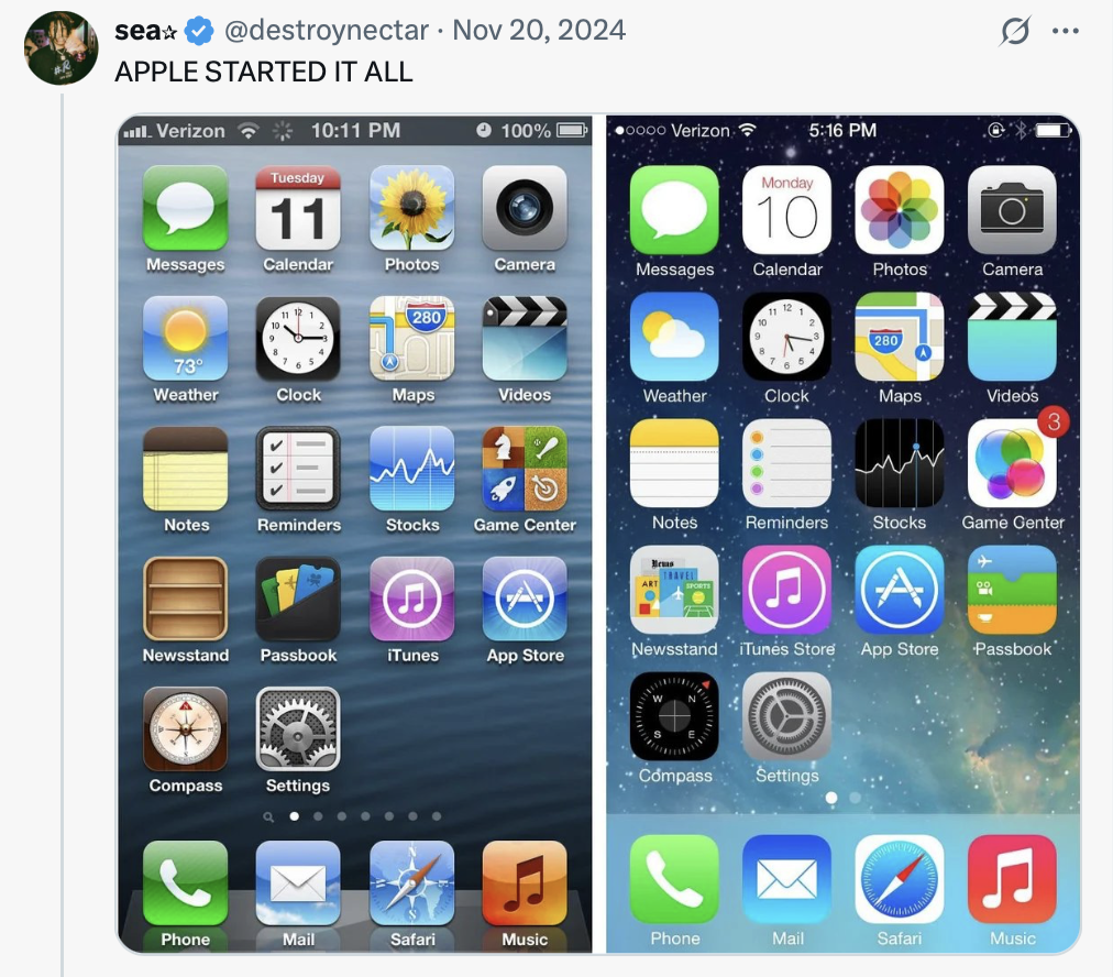
2.
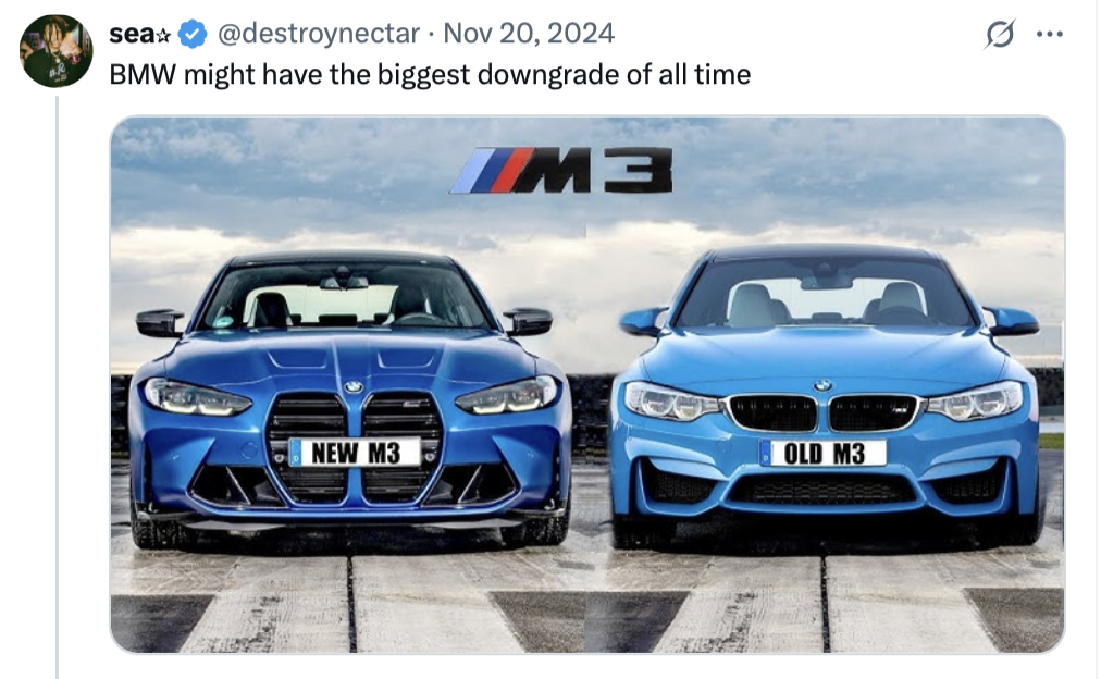
3.
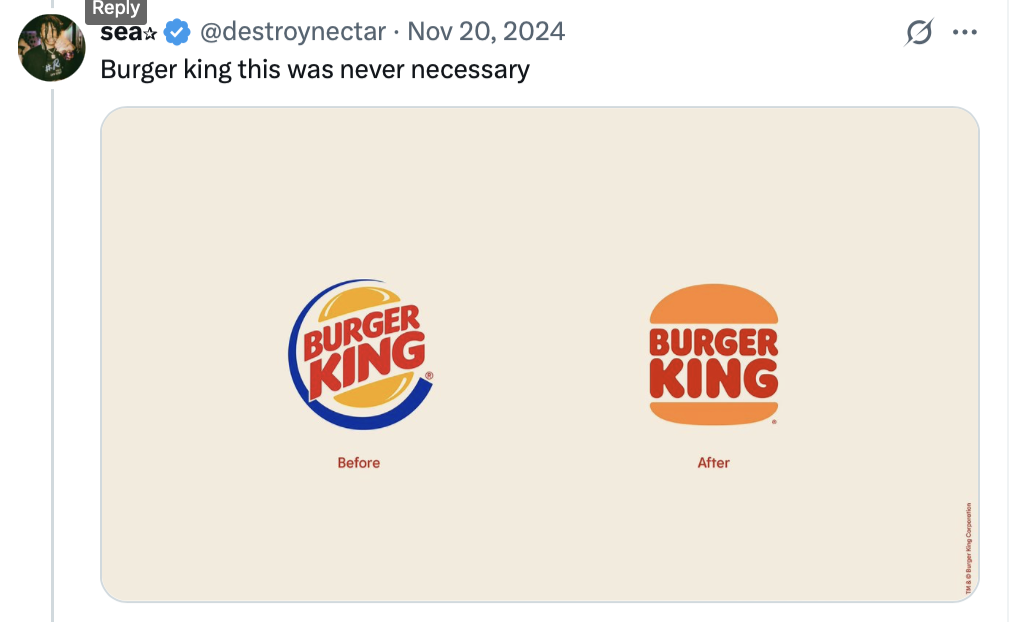
4.

5.
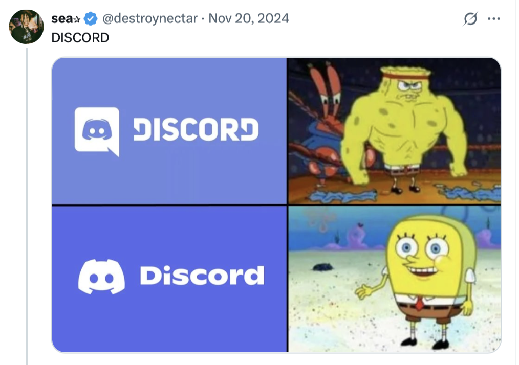
6.
7.

8.

9.
10.
11.

12.

13.
14.

15.

16.
17.

18.
19.
20.
Follow Chameleon Memes on Google News!
